


Siebdruck auf Leinwand Qualität Explained
A great print should not feel like a compromise. It should hold a wall with the same confidence as an original painting: clear color, physical presence, and enough detail to reward a closer look. That is what people mean when they search for Siebdruck auf Leinwand Qualität. They are not simply asking whether an image looks good online. They want to know whether the work will still look powerful in their home, office, or collection years from now.
Screen printing on canvas sits in an interesting space between artistic craft and editioned art. It can be bold, tactile, and highly collectible. But the term alone is not a quality seal. Two works may both be described as screen prints on canvas while differing dramatically in color depth, material quality, finish, and character.
What Gives a Screen Print on Canvas Real Presence?
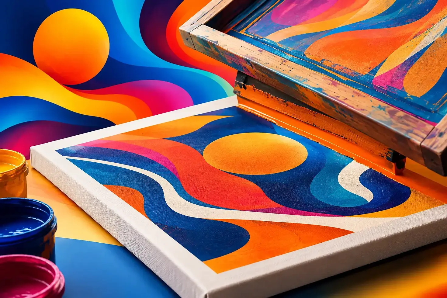
The screen-printing process is direct and physical. A separate screen is prepared for each color. Ink is then pushed through the mesh onto the canvas, layer by layer. This is not the same as sending a digital file to a standard printer. The process requires decisions about color separation, screen mesh, ink density, registration, drying time, and surface.
That labor is visible in a strong print. Colors sit on the canvas with authority rather than disappearing into it. Fine graphic lines remain sharp. Large areas of color look intentional, even, and alive. Depending on the ink and application, you may also see or feel a slight raised surface. This material quality matters, especially with Pop Art, portraits, automotive subjects, and high-contrast imagery. These motifs need clean edges, saturated color, and a format that does not lose energy at scale.
The best works do not try to pretend they are oil paintings. A screen print has its own visual language: crisp, graphic, immediate, and unapologetically direct.
Siebdruck auf Leinwand Qualität Starts With Materials
Canvas is not just a backing. It changes how a work feels in the room. A properly stretched artist canvas creates depth and gives the image a more object-like presence than paper behind glass. It catches light differently, introduces a subtle texture, and lets the work stand on its own without a frame if that is the intended presentation.
The quality of the canvas matters. A thin, loosely stretched surface can sag over time or make the print look flat. A stable canvas with a suitable primer provides a controlled ground for the ink. The print should adhere cleanly and remain visually balanced across the surface.
Ink choice is equally important. High-quality pigment inks are valued for their intensity and lightfastness. They help colors stay convincing rather than fading into a washed-out version of themselves. Bright reds, deep blacks, skin tones, fluorescent accents, and smooth color fields reveal weak materials quickly. If a work is built around a striking image, mediocre color is not a small flaw. It changes the entire effect.
That said, maximum gloss is not always the goal. A matte or semi-matte surface can be exactly right for a particular motif. Quality means that the material supports the artist’s intention. The finish should feel deliberate, not accidental.
Color Registration Separates Precision From Carelessness
Every additional color in screen printing creates another moment where precision matters. Registration is the alignment of those individual color layers. When it is exact, the image looks sharp and controlled. When it shifts, outlines may double, facial features can lose clarity, and graphic elements start to look unsteady.
Small variations are not automatically defects. In handmade screen printing, slight differences can be part of the edition’s character. The key question is whether the variation adds a human signature or simply signals poor execution. A misalignment that weakens the motif is a problem. A subtle shift that confirms the work was made by hand can make each piece more individual.
Edition Does Not Mean Anonymous
A limited edition is valuable because it combines accessibility with scarcity. More than one collector can own the work, but the number is clearly defined. That number should be transparent, as should the way the work is marked.
Look for a signature, edition number, and, where appropriate, the year or title. These details connect the physical object to the artist and the stated edition. They also make the work easier to document within a collection.
The edition size itself is not a shortcut to quality. An edition of 20 is not automatically better than an edition of 100. A smaller edition may be more exclusive, while a larger one can make a major image available to more people. What matters is that the edition is honestly communicated and consistently managed.
For collectors who want something beyond a conventional print, hand-finished elements can add another layer. Brushwork, acrylic accents, altered color passages, or individual marks make every canvas slightly different. The printed image provides the structure; the artist’s hand breaks the repetition. This is particularly compelling when contemporary digital imagery is translated into a physical, analog work.
How to Judge a Print Before You Buy
You do not need a conservation degree to recognize care. Start with the image itself. Look closely at the color areas, outlines, and transitions. Does the print appear clean and intentional? Is the contrast strong where it needs to be? Do faces, typography, or iconic details remain convincing when viewed at a larger scale?
Then consider the object. A canvas print should feel like art on a wall, not like a poster transferred onto fabric. Check whether the canvas is evenly stretched and whether the edges and corners are finished with care. If the work is shown in photographs, look for close-ups as well as full-room views. A close-up reveals texture, ink application, and surface character. A room view tells you whether the piece has the scale and visual force you are looking for.
Ask practical questions, too. Is the edition limited? Is the work signed and numbered? What materials are used? Is it screen printed by hand, digitally printed, or created through a mixed process? There is no single correct answer to every one of these questions. Digital reproduction can be appropriate for certain editions. But the description should be clear. Serious art does not need vague language to sound impressive.
The Difference Between a Screen Print and a Canvas Reproduction
This distinction is worth making because the terms are often blurred.
A screen print is created through screens and ink layers. It is a printmaking process with physical intervention at every stage. A canvas reproduction is generally a digital image printed directly onto canvas, often by inkjet. It can look good, especially at a distance, but it usually lacks the layered ink quality and handmade variation of a true screen print.
Neither format should be dismissed automatically. The better choice depends on what you want from the work. If your priority is a faithful, affordable reproduction of an image, a digital canvas print may make sense. If you value process, edition character, richer surface, and the tangible connection to printmaking, screen printing offers more.
The difference becomes especially visible in large-format work. At that scale, a good screen print can carry color across a room without looking mechanically enlarged. It has rhythm, texture, and visual weight.
Care Protects the Color and the Canvas
Quality also has a practical side. Even excellent inks and canvas benefit from sensible placement. Avoid prolonged direct sunlight, especially in rooms with strong afternoon exposure. Keep the work away from high humidity, radiators, and abrupt temperature changes. A bathroom or poorly ventilated space is rarely a good home for a canvas artwork.
For cleaning, a soft, dry feather duster or microfiber cloth is usually enough. Do not use household cleaners, water, or pressure on the printed surface. If the work ever needs serious cleaning or repair, a professional conservator is the right person to ask.
Framing is optional, not mandatory. Many contemporary canvas works are designed to be displayed without a frame, allowing the image to feel immediate and architectural. A floating frame can add a more formal finish, particularly in a business setting or a carefully structured interior. The right decision depends on the room, the scale, and whether you want the work to feel raw, graphic, or more refined.
Why the Artist’s Hand Still Matters
Contemporary images move fast. They are seen, shared, scrolled past, and replaced. Turning one into a substantial work on canvas changes the encounter. It asks the image to hold its ground outside the screen.
That is central to the work of Carsten Breuer: digital visual references meet paint, screen printing, and large-format craft. The result is not about reproducing the internet. It is about selecting images with cultural charge and giving them a surface, scale, and physical identity that demand attention.
When choosing a screen print on canvas, trust your eye but ask the concrete questions. Look for material honesty, strong color, controlled printing, a clearly defined edition, and a motif that still has something to say after the first glance. The right piece will not merely match your wall. It will change the room around it.



Kommentare